The art of reading financial charts is a skill that’s crucial for every investor, regardless of the types of assets they trade. But as helpful as they can be, charts can appear a bit overwhelming at first, especially if you’re new to investing in general.
Charts are beneficial for a variety of reasons, from helping you better navigate the stock market to assisting you in making more prudent financial decisions. If you’re considering investing in commodity futures, charts can play a big role in your choices, too. Get started in learning the basics of these tools by taking a look at commodity futures trading charts and the ways you can interpret the details they’re conveying.
What Are Commodity Futures?

Before delving into the information you can learn from commodity futures trading charts, it’s important to know what commodity trading is and how it works. Commodities trading is a form of derivatives trading. Derivatives are, in essence, financial contracts that grant the buyer the right to buy (or sell) a specific asset by a certain date and at an agreed upon price.
When investors purchase this type of contract, they stand a chance of scoring a bargain buy if an asset’s value goes up due to volatility. The hope is that, by the time the contract expires, the asset they’ve claimed the right to buy for a certain price will be worth more than that price. Thus, they’ll theoretically be able to buy the asset at a discount.
Commodity futures contracts specifically allow you the right to buy or sell a commodity by a certain date and at an agreed-upon price. The three most common assets that commodities cover are food, energy and metals; typical commodities include wheat, gold, silver, corn and natural gas.
When you buy a commodity futures contract for one of these assets, it gives you the chance to make a profit. At the same time, it also offsets your risk in case the price rises beyond your agreed upon price. Sellers, on the other hand, can use these contracts to guarantee that they get a certain price for a product, even if the value drops below the agreed price.
Buying a commodity future doesn’t necessarily mean that you actually want to purchase, say, 1,000 barrels of oil at a particular price. Many traders invest in these types of contracts and then sell them on the market. In this way, commodity futures trading is often more or less betting on whether the price of a particular asset will go up or down within a certain amount of time.
The Importance of Commodity Futures Trading Charts
This type of trading can be quite risky and complicated. You may want to reconsider undertaking it until you’ve gained more experience if you’re currently a beginner at investing or unless you’re trading under the guidance of someone who’s familiar with this process. The safest ways to trade commodities futures are through funds like commodity ETFs or commodity mutual funds.
If you do plan to pursue commodity futures investing, it’s essential to learn how to read futures charts. Learning to read futures charts is just as important for a commodities trader as learning to read stock charts is for stock investors. Futures charts provide a visual representation of an asset’s price movement in response to supply and demand.
Just as with stock charts, futures charts can help investors track an asset’s price movement over the course of its history. By spotting trends that tend to emerge across charts in general, this information can help reduce risk by giving investors a more informed guess of where an asset’s price is likely headed.
While there’s no guaranteed way to predict the future of any asset, investors learn to read futures charts for the same reasons that meteorologists learn to read weather maps. By analyzing the data and comparing them to similar data from the past, the margin for error is significantly reduced in both cases.
Breaking Down the Elements of Futures Trading Charts
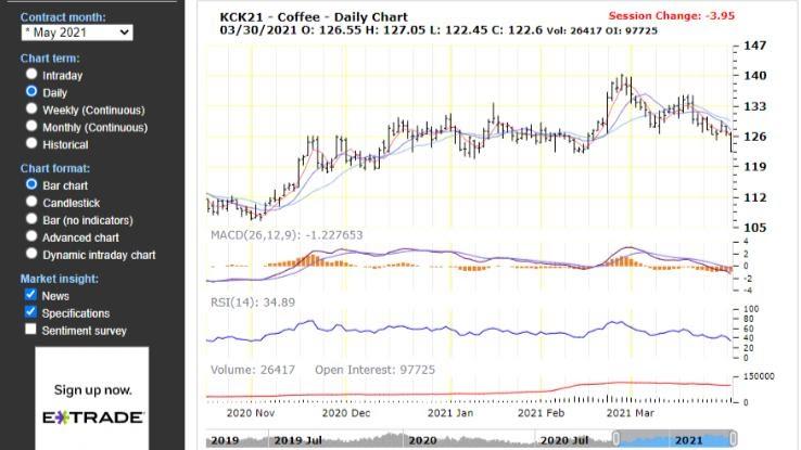
When you first begin looking at futures charts, such as this example from TradingCharts.com, they may seem a bit confusing. That’s why it’s helpful to break down the wealth of information they contain to better understand what each detail means. Two of the most important parts of a chart are the date and price ranges.
Date: On the horizontal line at the bottom of the chart pictured here, you’ll find a selection of dates. In the case of the example, we’re looking at a daily chart that tracks an asset’s price movement over a short-term basis. You can select the range of dates you’d like to see, however, by choosing whether you want to view a breakdown of the asset’s history on a daily, weekly, monthly or historical basis. You can even choose an “interday” view to see the asset’s price movement over the course of a given day.
Price: In the pictured chart, which tracks the price of coffee commodities, you’ll find a vertical column that represents various prices on the left-hand side. Each of the bars on the bar graph in the center of the chart represents that asset’s price range during the time period indicated on the date bar below. Notice that each vertical bar has a small horizontal line drawn through it at some point. This represents the price at which the asset closed during that time period.
Using Charts to Spot Trends and Momentum
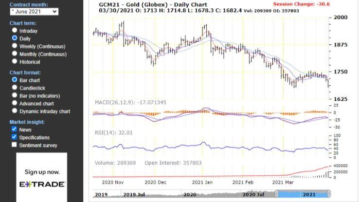
Several elements of a trading chart can help you determine the prospective performance outlook of a stock. These details aren’t hard-and-fast guarantees about how you can expect an investment to continue performing, but they are suggestions that can help shape your expectations somewhat and help you better anticipate the direction values may head in based on patterns.
Volume: At the bottom of the chart, right above the date line, you’ll see “volume movement,” which is represented by a series of short vertical bars. This is where you can track how much volume (buying and selling) the asset experienced during the corresponding time period. Volume can be a good way to gauge the supply and demand of a particular asset.
MACD: This stands for “moving average convergence divergence” and visualizes the asset price’s changes in momentum, strength and direction. Similar to a moving average in stocks, it’s used to indicate trends. When it moves above zero, that’s considered a bullish sign. When it crosses below zero, that’s a sign that things are getting bearish.
RSI: The relative strength index is used to evaluate whether recent price changes indicate that an asset is being overbought or undersold. The RSI moves between two lines, which represent the two extremes of 0 and 100. Traditionally, if the RSI moves above 70, that indicates that the asset is being overbought and overvalued. If it dips below 30, however, this may indicate that the asset is undervalued and being oversold. In the case of the example pictured, you can see that gold has been experiencing heavy volume and is dipping down into the 30s, which indicates that it may be in danger of becoming oversold.


